
How to Design Blockchain UX When Users Have Zero Tolerance for Mistakes

Every action in a blockchain product leads to a result that users cannot reverse. Users confirm transactions, grant permissions, and move assets with full responsibility for each step. This raises expectations for clarity, structure, and consistency across every interaction. Such conditions set strict requirements for blockchain UX design, where flows must guide decisions with precision and remove ambiguity at critical moments. Clear and reliable interactions become a baseline for user confidence in high-risk scenarios.
In this guide, the Arounda team shares practical approaches to blockchain UX, covering flow structure, interaction patterns, and system logic that support accurate decisions and reduce risk in real use cases.
Article Key Takeaways
This article breaks down how to design blockchain UX in products where users make decisions they cannot easily reverse:
- What the first session must achieve, combined with onboarding and progressive disclosure patterns that introduce complexity step by step
- Practical approaches to transaction previews and confirmation flows that help users verify outcomes before acting
- How trust signals, system feedback, and interface states support confident decisions in high-risk interactions
- Design principles for different blockchain product types, with patterns that address real usability challenges and the biggest UX problems in DeFi platforms and their solutions
- Expert perspectives, practical recommendations, and Arounda team insights on building scalable design systems and keeping UX consistent as products grow
Why Blockchain UX Fails Differently
Blockchain products require users to make decisions without a chance to correct them later, which changes how failures appear in the product. Users evaluate each step before they act, and uncertainty at this stage leads to hesitation or drop-off. Gaps in blockchain UX break their confidence early and stop progress.
This pattern shows in user behavior. Around 22.5% avoid crypto products due to complicated onboarding, such as wallet setup and seed phrases, while 17% leave because of poor UX. These signals explain why crypto UX design fails earlier in the flow, when users decide whether to continue or exit.
“Users approach blockchain products expecting to understand each step before they act. They look for signals that confirm what will happen next and whether the action is safe to proceed. When flows lack consistency or key details are missing, hesitation appears immediately. Interfaces need to present outcomes clearly, keep interactions predictable, and build trust through transparency at each step, especially in moments where users commit to an irreversible action.”
Vlad Gavriluk, Founder & CEO at Arounda
Small UX Decisions With Massive Consequences
Even small blockchain UX decisions carry weight and influence whether users move forward or stop. The most damaging friction often starts with minor issues that later become blockchain UX mistakes that kill user retention in serious crypto products. Confirmation logic, system messaging, and the timing of security steps usually expose these problems first.
Confirmation flows built for developers
Confirmation flows often reflect system logic instead of user understanding. Users see technical details and unclear outcomes at the moment they need to approve or reject an action. This becomes one of the key reasons users abandon blockchain products during transaction confirmation, especially when the interface does not clearly show what will happen after approval.
Common patterns where this happens:
- Transaction screens show hashes, fees, or contract data without explaining the result
- Users cannot clearly see what they will send, receive, or approve
- Confirmations require interpretation instead of providing a clear summary
- Critical details appear only after approval or stay hidden behind technical labels
How to fix this?
Start with UX research to identify where users pause, reread, or cancel actions because they cannot verify the outcome. Use these insights to turn confirmation steps into clear summaries that show assets, amounts, permissions, and final results before approval, so blockchain UX supports confident decisions at the moment they matter.
Error messages that describe systems, not problems
System-level error messages interrupt user actions without explaining what went wrong in a usable way. They force interpretation at critical moments and block progress when users expect clear direction. This turns a small detail into a failure point and exposes gaps in the UX design blockchain.
For example: “Transaction failed.”
This message gives no context or direction, so users do not understand what caused the issue or how to proceed.
How to fix this?
Write error messages from the user's point of view. Clearly identify why an issue exists, show how it impacts the user, and then provide next steps to resolve.
For example: “Transaction failed due to insufficient funds for the network fee. Please add funds to your wallet and try again.”
This version explains the issue and gives a direct action, which improves blockchain UI UX by helping users resolve the issue and move forward without hesitation.
Security barriers placed at the wrong moment
Security steps lose their value when they interrupt the flow instead of supporting it. Users face extra confirmations before they understand the action or after they have already decided to proceed, which creates confusion and slows the process. UX/UI audit helps identify these gaps, where security does not align with user intent and weakens the consistency of blockchain UX design.
These problems usually occur when:
- Confirmation appears before users see full transaction details
- Extra verification interrupts a simple action without warning
- Repeated approvals show up with no explanation
- Security warnings appear without explaining the risk or impact
How to fix this?
Place security steps at the moment when users expect them and understand their purpose. Group confirmations into a single clear step and explain why each action requires approval, so blockchain UX stays predictable and does not interrupt decision-making.
Blockchain User Experience Across Product Types
Blockchain UX varies by product type, since each format defines its own interaction model, level of control, and user responsibility. The differences in UX approach between DEX and centralized exchange platforms highlight these shifts, alongside distinct design requirements in wallets and NFT marketplaces.
CEX platforms: trust through familiarity
CEX platforms handle complexity through a structure users already recognize. People come to these products expecting account-based logic, visible control over funds, and flows that resemble digital banking. This makes the blockchain user experience in CEX products more dependent on familiarity, clarity, and stable navigation patterns.
Key design principles for CEX platforms:
- Use layouts users already know from financial dashboards and exchange interfaces
- Keep balances, transaction history, and main actions visible on the first screen
- Make trading, deposit, and withdrawal flows easy to scan and confirm
- Maintain consistent feedback and status updates across the entire blockchain UX UI
DEX and DeFi: power without overwhelming
DEX and DeFi platforms give users full control over actions that traditional products usually handle in the background. This shifts more decisions into the interface and increases the effort required to complete each step. To move forward, users need clear guidance and predictable flows, so UX blockchain design must reduce complexity without removing control.
Key design principles for DEX and DeFi platforms:
- Present complex actions as step-by-step flows instead of exposing full protocol logic at once
- Show transaction details, risks, and outcomes before users confirm actions
- Keep approvals, swaps, and permissions clearly separated and easy to follow
- Provide context for fees, slippage, and asset changes in plain language
- Reduce cognitive load by prioritizing key actions and hiding secondary details
This approach helps structure blockchain UX around clarity and control, without overwhelming users with technical complexity.
A clear example of structuring complex DeFi flows is our work with Enzyme, a platform that allows users to create, manage, and invest in on-chain portfolios. The client needed to make complex DeFi tools easier to navigate and understand without reducing functionality. We simplified investment flows into clear steps, structured information through consistent layouts and clear visual hierarchy, and designed a modular system that made interactions feel predictable across the platform.
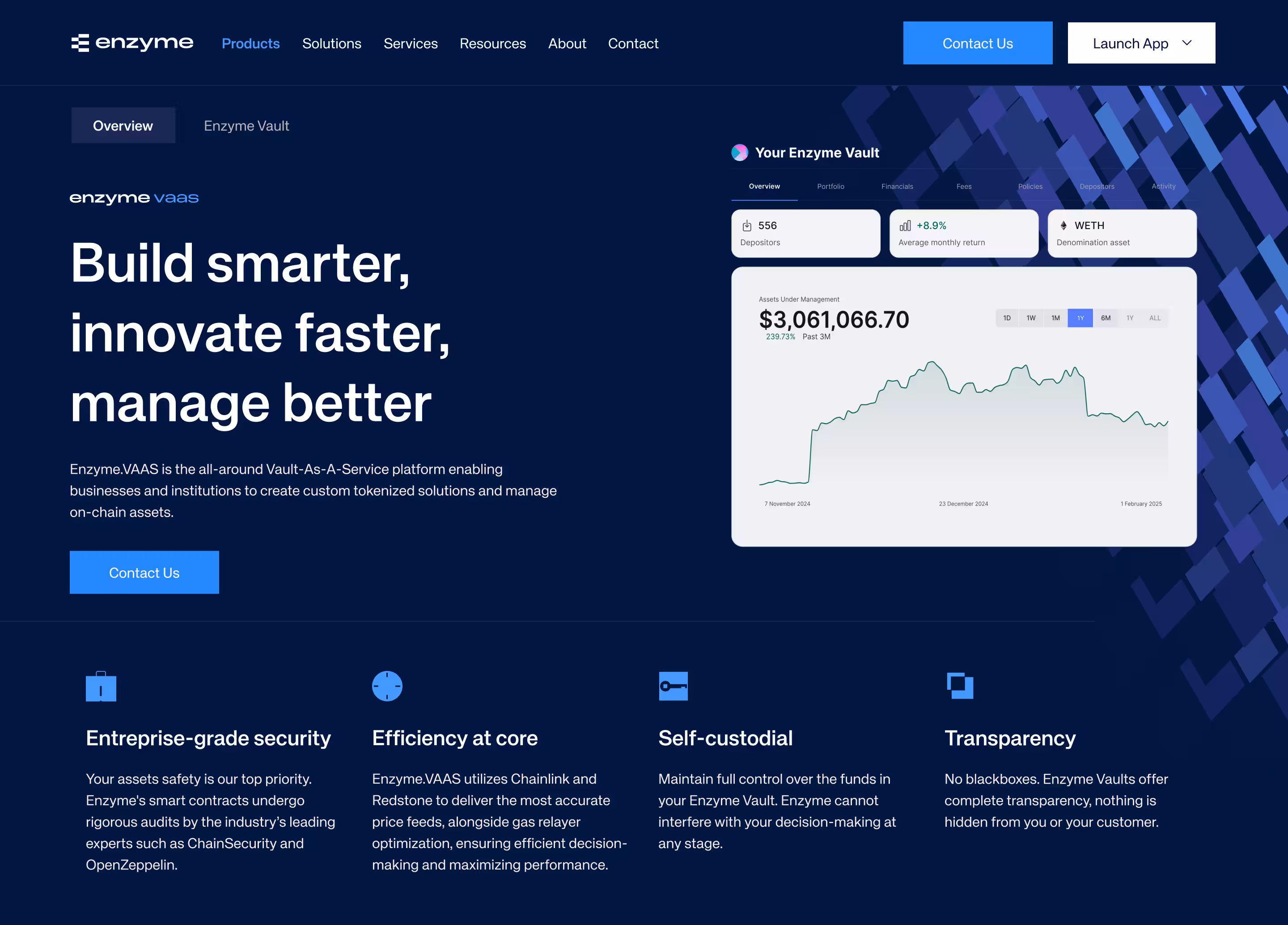
The results were +42% conversion rate, +36% user engagement, +48% mobile retention, and +31% feature adoption.
Crypto wallets: clarity under pressure
Crypto wallets handle actions where users need to move assets or approve access quickly and without error. Each step happens under pressure, often on small screens, where even a little mistake can lead to loss. This makes crypto UX design focused on clear verification and minimal steps at the moment of action. In this context, blockchain UX must support fast decisions while keeping critical details easy to review.
Key design principles for crypto wallets:
- Display address, amount, network, and fees on one screen before confirmation
- Highlight critical data visually so users can verify it at a glance
- Reduce the number of steps in send and approval flows to avoid interruptions
- Use clear labels and formatting to prevent misreading of wallet addresses
- Ensure the design stays responsive across devices so interactions remain consistent in different contexts
NFT marketplaces: discovery without overload
NFT marketplaces center on browsing, comparing, and selecting assets within large collections. Users move through dense visual grids and make quick decisions based on limited context. This makes blockchain user experience dependent on clear structure and navigation, where strong web design defines how easily users can find and evaluate assets.
Key design principles for NFT marketplaces:
- Organize assets into easily grasped categories and collections to aid fast discovery
- Use consistent grid layouts and spacing so users can scan content without overload
- Show key details like price, rarity, and ownership directly on each card for better blockchain UX UI
- Provide sorting and filtering that match user intent, such as price, popularity, or recent activity
- Keep navigation simple and persistent so users can explore without losing context
Designing Around Transactions You Can't Undo
Blockchain UX design for irreversible transactions requires a different approach, since users confirm actions without a chance to correct them later. Here, users must understand outcomes, risks, and important details before continuing, so that every decision is made with complete context. UI/UX design should guide them through this via a clear sequence of steps.
UX design principles for irreversible blockchain transactions:
- Show the resulting state of the action, including balance changes and asset movement, before approval
- Separate input, review, and confirmation into clear stages to support step-by-step validation
- Introduce contextual warnings based on user actions, such as unusual amounts or unknown addresses
- Lock critical parameters during confirmation to prevent last-second accidental changes
- Reveal advanced details like fees, slippage, or contract data only when users need them, without overloading the main flow

How Blockchain UX Breaks at Scale
As products scale, early design decisions stop working across new audiences, features, and usage contexts. Growth introduces complexity across flows, chains, and devices, so blockchain UX must rely on consistent structure and scalable patterns to keep interactions clear and predictable.
When users outgrow crypto-native audiences
Crypto products often start with experienced users who understand wallets, fees, and transaction logic. As the product grows, new users expect simpler flows, clearer language, and familiar interaction patterns. This shift creates gaps in blockchain user experience, where interfaces built for advanced users no longer support broader adoption. As a result, blockchain UX UI becomes harder to navigate and requires a redesign to match new expectations.
Arounda experts recommend:
- Design a clear primary screen with only essential actions and data, and place advanced tools in secondary sections that users can access when needed
- Set practical defaults for network, fees, and tokens so new users can complete actions without setup, while keeping these options editable for experienced users
- Prioritize key decisions and inputs by using hierarchy and spacing, helping users focus on what’s important instead of scanning everything
- Provide concise inline labels next to actions so users know what will happen next without leaving the flow
Consistency across chains and surfaces
As products expand across chains and devices, the same action often follows different rules, formats, or steps depending on the context. Users start to notice mismatches in flows, data presentation, and screen structure, which creates confusion and slows down decisions.
To achieve blockchain UI UX consistency across multiple chains and product surfaces, there should be a unified interaction model. Users should be able to notice patterns and perform the same actions everywhere in the blockchain ecosystem. This includes responsive web design, where the layout adapts to the size and shape of different screens, while the overall logic and flow remain the same.
Arounda experts recommend:
- Use one consistent flow for each key action across all chains so users follow the same steps every time
- Standardize how transaction data appears so amounts, fees, and addresses follow the same format in every context
- Keep layouts and components responsive so users recognize the interface and do not get lost across devices
- Align interaction feedback across chains, so confirmations, errors, and states look and behave the same in every context
Design systems that scale UX decisions
Design systems keep UX decisions consistent as products scale, and teams add new features, flows, and edge cases. Without a shared system, the same actions start to produce different effects throughout the interface, and users no longer understand how to use the product. Crypto UX design should rely on well-defined patterns, components, and interaction rules that teams can reuse rather than recreate for every new case.
A strong foundation for these decisions starts at the UI concept stage, where teams define structure, behavior, and visual logic early on. This makes it possible to scale the product without breaking consistency and gives a clear base for designing new features.
Arounda experts recommend:
- Define core patterns for key actions and extend them when adding new flows instead of creating new interaction logic
- Build components as flexible blocks that support different states and edge cases without redesign
- Set clear rules for how new features integrate into existing flows so they do not break established patterns
- Review new screens against the system and adjust them to fit the existing structure before release
This approach keeps design decisions consistent as the product evolves and helps teams scale without breaking the blockchain user experience.
A good example of this is our work with MarketSpotter, a Web3 platform for market analysis and trading insights. The client came to us looking to redesign an outdated trading platform and improve navigation, clarity, and usability. Our design team restructured the interface layout, simplified navigation, and improved visual hierarchy so users can read charts and data without confusion. We also redesigned data-heavy screens into cleaner layouts and ensured that the interface works seamlessly across desktop, tablet, and mobile devices, so users can interact with the product the same way, no matter which screen they are on.

As a result, the platform reduced onboarding drop-off by 28% and increased user engagement by 35%, while mobile usage grew by 50%.
Onboarding: Where Most Products Lose Users
Onboarding defines whether users continue or leave after the first interaction. Complex steps with unclear actions and unfamiliar concepts can lead to friction and break early engagement. Blockchain UX design must simplify the first experience, lead users through key actions, and help them to understand how the product works right from the start.
What the first session must accomplish
The first time users interact with the product, they spend their time trying to figure out what it does, how it works, and if they can trust it enough to stick around. The interface should help them get to a clear first result, get them to complete a simple action, and see how the product responds. Teams need to shape this flow at the MVP design stage, so the first session leads users to value without extra steps or friction.
For example, here are some of the best UX patterns for crypto wallet onboarding for non-technical users:
- Guide users to create or connect a wallet with clear steps and minimal input
- Explain what happens next at each step so users do not hesitate or drop off
- Lead users to complete their first simple transaction or action to demonstrate value
- Confirm each step with clear feedback so users understand progress and results
Progressive disclosure as a strategy
Progressive disclosure helps to gradually introduce the product. This allows users to encounter only what they need to at each step and focus on actions first and details second. This approach keeps early interactions clear and manageable in blockchain UI UX, where too much information can overwhelm new users.
Here is how to apply progressive disclosure in onboarding:
- Show one decision per step and move forward only after the user completes it
- Introduce details like fees or network selection only at the point of action
- Keep advanced settings hidden behind clear controls until users choose to access them
- Split complex flows into short, sequential steps that are easy to follow
This way, users stay focused on each step and gain understanding without facing full complexity at once.
A good example is our work with GT Protocol, an AI-powered investment platform. The product needed to make complex trading, portfolio management, and onboarding accessible for both new and experienced users. Our design team created a guided onboarding flow with an AI assistant walking users through setting up a wallet and completing their first actions one step at a time. We improved navigation and visual hierarchy, added clear visual cues, and applied progressive disclosure, with the experience remaining intuitive across devices.

The results were 2× client base growth, 88% user satisfaction, and a 52% increase in community engagement.
Building Trust Without a Safety Net
Trust becomes a critical factor in blockchain products, where users make decisions without a chance to undo them. The interface needs to show clear outcomes, system status, and next steps so users understand what is happening at every moment. To support this, platforms need trust signals that work in high-stakes blockchain product design, which guide users through critical actions and reduce uncertainty.
Transaction previews and pre-confirmation summaries
Transaction previews and pre-confirmation summaries show users the exact outcome before they confirm an action and become a critical trust point in high-risk flows. A clear preview supports blockchain UX design by reducing uncertainty and keeping all key details visible at the moment of decision. This step also shapes the customer experience, where users rely on clarity to confirm trust before proceeding.
A well-designed preview includes:
- Transaction amount and asset as the primary values
- Network and fees displayed next to the action
- Destination address formatted for quick visual check
- Final outcome, including what the user sends and receives
Arounda team suggests: keep the preview visible within the confirmation step and avoid hidden or expandable sections for critical data. Users should see and verify key details instantly without navigating away or revealing additional layers.
Status transparency during pending states
Users lose confidence when a transaction enters a pending state without clear feedback. Blockchain UX must show what is happening, what stage the transaction has reached, and what the user should expect next.
Clear status communication should cover:
- Current stage of the transaction: submitted, validating, confirmed
- Estimated time based on network conditions
- Visible indicators of progress
- Access to transaction details such as fees, hash, and network
Arounda team suggests: give status an anchor to the original action point and update it in place until completion, so users see the result exactly where they initiate it without navigating across screens. You can also mirror this status in the transaction history in real time, so users always have a clear record of what happened.
Language that matches user mental models
Language should reflect how users already understand actions and outcomes when they interact with a product. Clear wording helps them predict what will happen before they confirm and reduces the need to interpret technical terms. This clarity builds trust in the blockchain user experience, where each action carries irreversible consequences.
To reflect user mental models, product language should:
- Use action-based labels that match intent, such as “Send,” “Receive,” and “Swap”
- Keep terminology consistent across buttons, confirmations, and status states
- Explain transaction outcomes in direct terms, including what changes in balance or ownership
- Introduce blockchain-specific terms only with short, contextual explanations
Arounda team suggests: standardize transaction language as part of the design system and map each action to a fixed set of terms, confirmation patterns, and status messages. This creates a consistent mental model across the product, reduces misinterpretation in critical flows, and ensures users understand the result before they confirm any transaction.
Blockchain UX Design Checklist for Product Teams
Summary
Products where users cannot afford mistakes require a clear structure and predictable interactions at every step. Blockchain UI UX needs to remove uncertainty so users can act without second-guessing their decisions. We covered how this depends on guided onboarding, transparent actions, consistent patterns, and reliable system feedback that support users as the product grows. When these elements work together, users stay in control and complete actions with confidence.
At Arounda, we focus on making complex products clear, structured, and easy to use in real scenarios. Our team shapes onboarding, improves critical flows, and builds systems that stay consistent as products grow. If you want to improve your product experience and make it easier to use and trust, contact us.


Table of contents


FAQ
Blockchain UX deals with irreversible actions, shared responsibility between the product and external networks, and direct user control over assets. Traditional digital products can correct errors in the background, while blockchain interfaces must prevent them before they happen. This changes the role of UX design from optimizing flows to making outcomes clear, risks visible, and user decisions fully informed at every step.
Crypto products expose users to technical steps like selecting networks, choosing fees, approving transactions, and interacting with wallets directly, where fintech systems bury most of this logic in the background. When the interface presents this in a non-structured way, users don’t recognize what they should do and stall before acting. Design should translate the technical steps into clear, guided user flows that drive users towards digestible outcomes so they can complete actions without hesitation.
The highest levels of drop-off happen when transaction outcomes are unclear, onboarding is intricate, and status feedback is weak during key actions. Users do not stick around when they do not understand what will happen post confirmation, how to proceed next, or if the action even went through. Confusing wallet setups, technical wording, and a lack of updates during pending states confuse users and cause them to leave.
Non-technical users are faced with strange new concepts like wallets, networks, and permissions right from the first step. When onboarding throws too many things at once or doesn’t provide guidance, they lose confidence and stop. Onboarding should offer clear steps that guide users, briefly explain each action and why they’re doing it, and show them what to expect before proceeding to the next step.
The highest ROI comes from the first session, onboarding, and initial transaction flows, where users decide whether to continue or leave. Improvements at this stage increase activation, reduce early drop-off, and build trust before users engage with more complex features. Fixing these moments early also prevents larger UX issues as the product grows and adds new functionality.


89+ Reviews
on Clutch

Top Rated Plus Agency
on Upwork

Top 50 Trending team
on Dribbble

Projects are Featured on Behance platform
